Introduction
I embarked on this ePortfolio journey with a vision in mind, and today, I’m excited to share the journey of transformation it has undergone. Over time, I’ve evolved my ePortfolio to reflect my educational experiences, personal growth, and passion for lifelong learning. Join me on this ride as I walk you through the remarkable changes I’ve made.
Original Theme vs. Current Theme
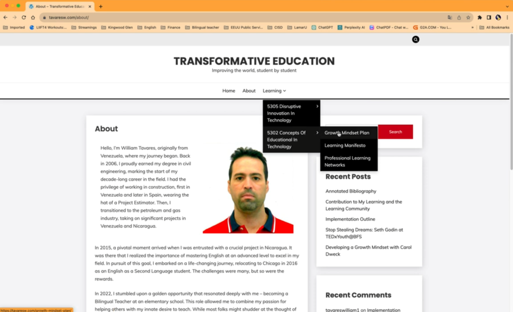
In the beginning, my ePortfolio sported a different theme on WordPress (see image above), but I wasn’t satisfied. I wanted a design that resonated better with my vision. That’s when I switched to the current theme, which perfectly aligns with the direction I envisioned.
Rebranding and Logo
The transformation wasn’t just visual; I also rebranded my ePortfolio. It’s no longer just about transformative education; it’s about the journey of lifelong learning. To capture this essence, I created a logo that symbolizes this commitment.
A Splash of Colors
The color palette underwent a transformation, too. I said goodbye to the old colors and embraced vibrant shades of orange and black, signifying energy, creativity, and the depth of knowledge.
Sidebar Eliminated
To simplify the layout and streamline navigation, I decided to eliminate the sidebar, giving my ePortfolio a cleaner, more focused appearance.
Dropdown Menu to Mega Menu
One of the most significant changes involved revamping the navigation. Initially, I used a dropdown menu system, but as my ePortfolio grew, I felt the need for a more sophisticated navigation system. That’s when I switched to the current mega menu, making it easier for visitors to explore my content.
Expanding the Menu
My menu began with only three essentials – Home, About, and Learning. However, I soon realized the need for a dedicated blog section. It’s now an integral part of my ePortfolio, housing all my blog posts, neatly organized for easy exploration.
Adding Icons
To enhance the user experience, I incorporated icons into both the Main Menu and submenu, making navigation more visually appealing and intuitive.
Home Page Redesigned
The home page, previously a central place for my most recent blogs, has been completely redesigned. Now, it features a brief introduction to me, providing links to my About Page, My Learning section, and Blog Section. Additionally, you’ll find the four initial courses I embarked on, along with snippets from four of my blog posts.
About Page Enhanced
The About Page, a glimpse into my journey, has been enriched with more details. I’ve added a whole paragraph about my learning experiences. Additionally, you’ll find insights into my collaborative team, as they’re an integral part of my learning journey.
Introducing Highlight Labels
To highlight my two most recent courses within the Learning section of the main menu, I introduced a vibrant blue label, ensuring that they stand out within the context of my educational journey.
Conclusion
This journey of transformation in my ePortfolio has been an incredible one, reflective of my evolving learning experiences and my passion for lifelong learning. I hope you enjoy exploring my ePortfolio and the content within. Thank you for joining me on this journey!
References
Moore, T. (2021, Nov 15). How To Make a WordPress Blog – Step by Step [Video]. YouTube. https://www.youtube.com/watch?v=BhltwjuiEk4&t=19s.
Create WP Site. (2021, April 1). How To Make A WordPress Blog 2023 [MADE EASY] [Video]. YouTube. https://www.youtube.com/watch?v=d5-V3xrIFX4.
Create WP Site. (2021, April 15). WordPress Tutorial For Beginners 2023 [Made Easy] [Video]. YouTube. https://www.youtube.com/watch?v=kYY88h5J86A&list=LL&index=40&t=693s.


